TOSHIBA
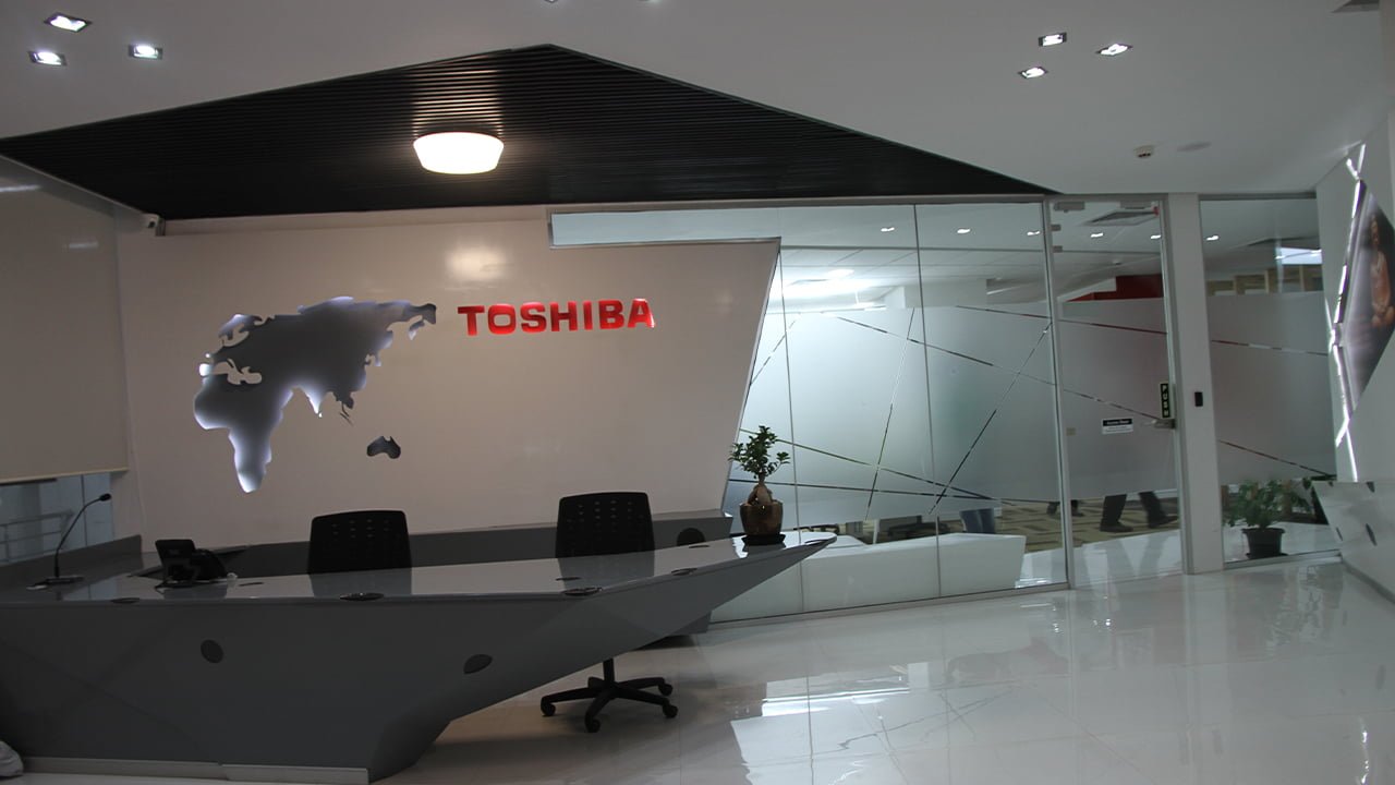
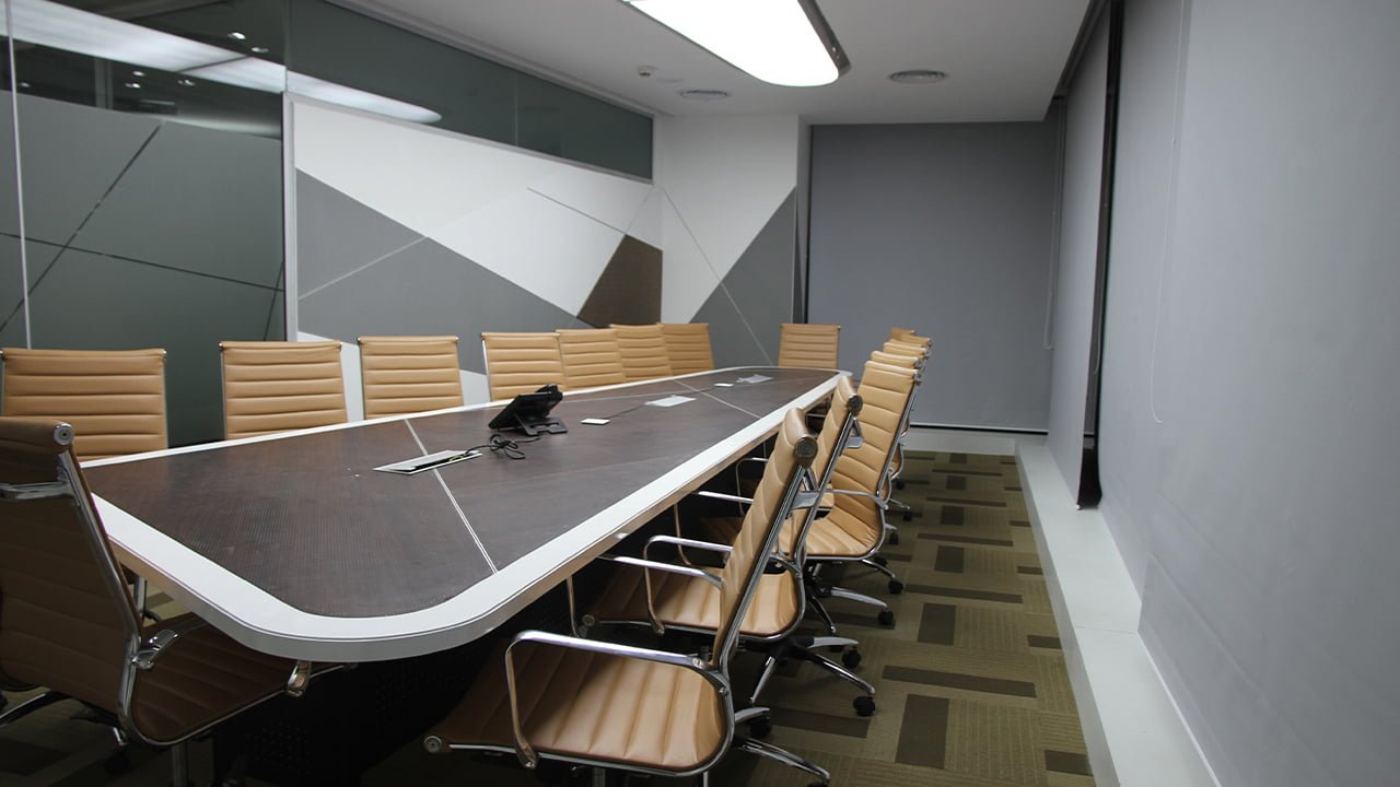


The Ask: Toshiba’s offices in multiple locations of India had to follow the organisation’s philosophy and cultural standards.As a global organisation, they didn’t want India offices and employees to be different from the global structure.
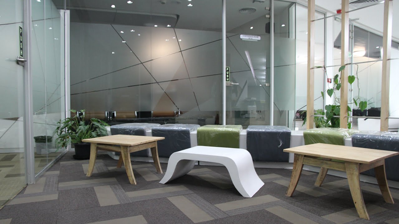
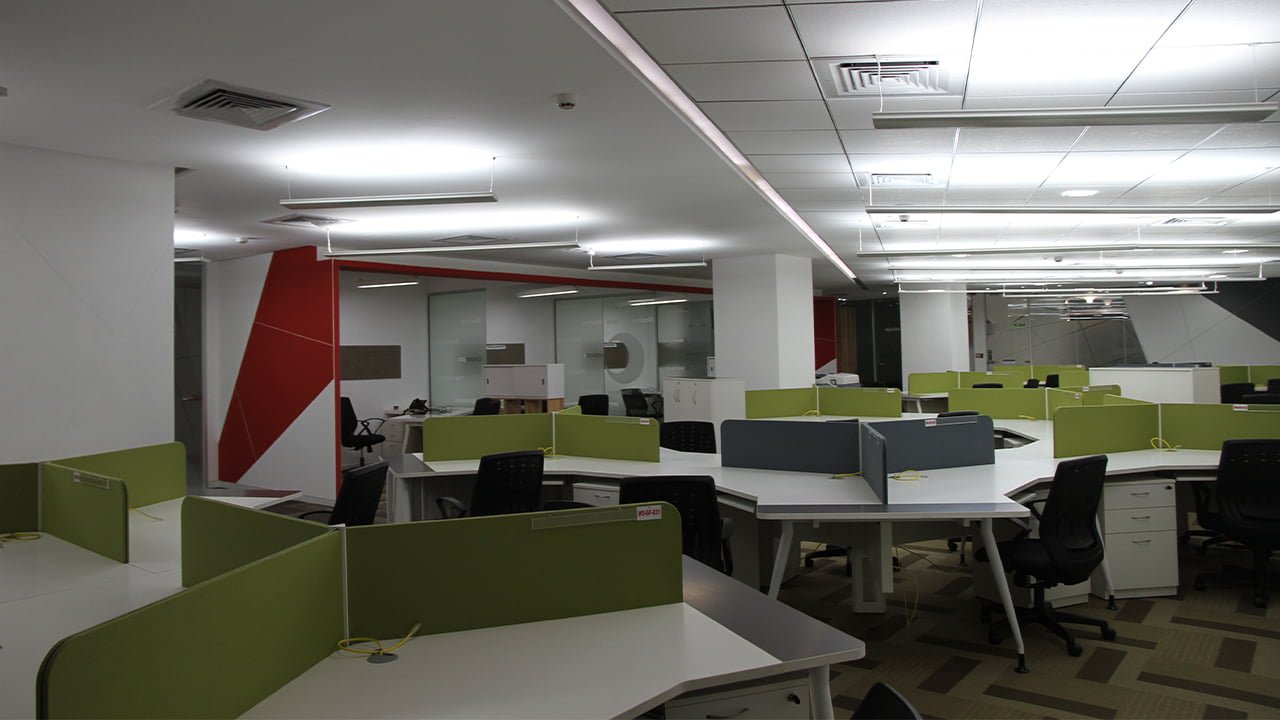
The Approach: Toshiba being an innovation-led organisation had to reflect its office spaces with innovation and interaction at the centre. Hence, as per our design, both active and passive project spaces were kept within the buildings’ central zones. With focus on visibility and transparency, multifunctional project spaces have been created centrally within the base of the voids to ensure greater staff interaction and
connectivity.
• Uninterrupted glass surfaces virtually extended the interior space
• Distinct colours of the carpets helped in demarking various spaces
• The ceiling colour was chosen to be grey to particularly expand the interior spaces visually For the FNF, it was a completely corporate yet dynamic design approach.
• The lobby got a lively appearance with various linear and abstract patterns
• The bay areas were made to look diverse yet harmonious andenjoyable
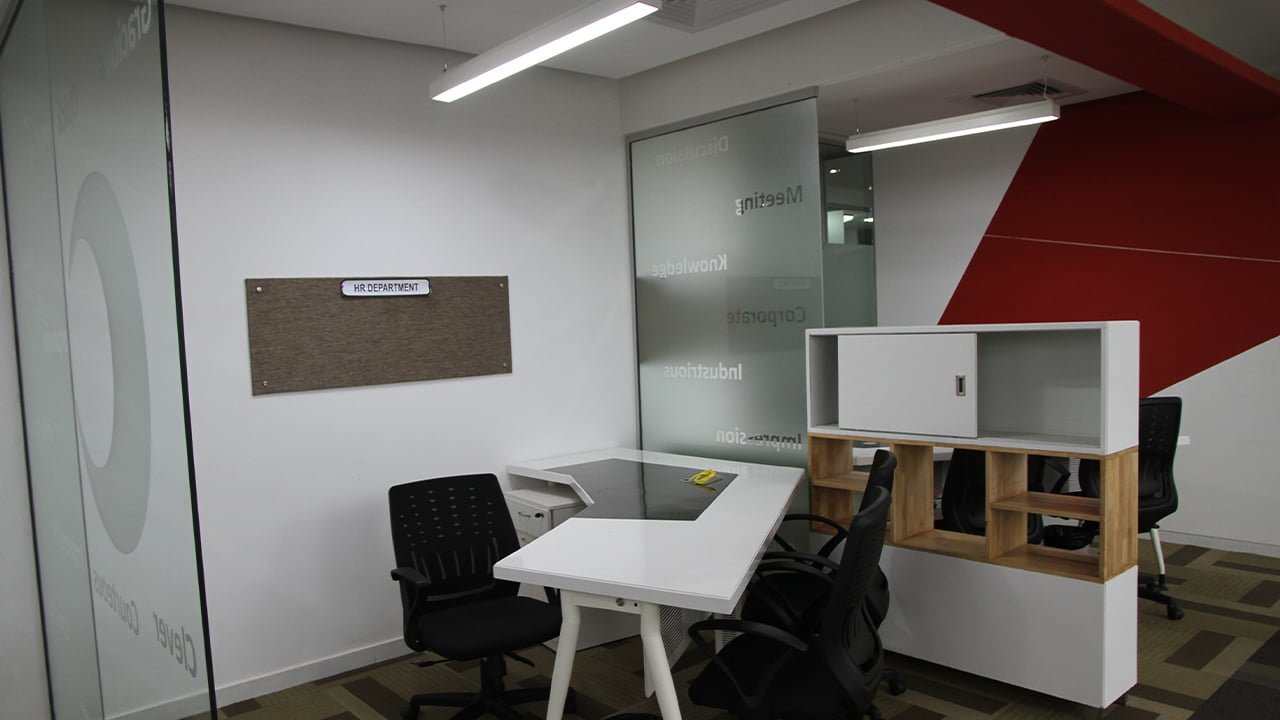
• Executive workspaces were made functional yet neutral and calm
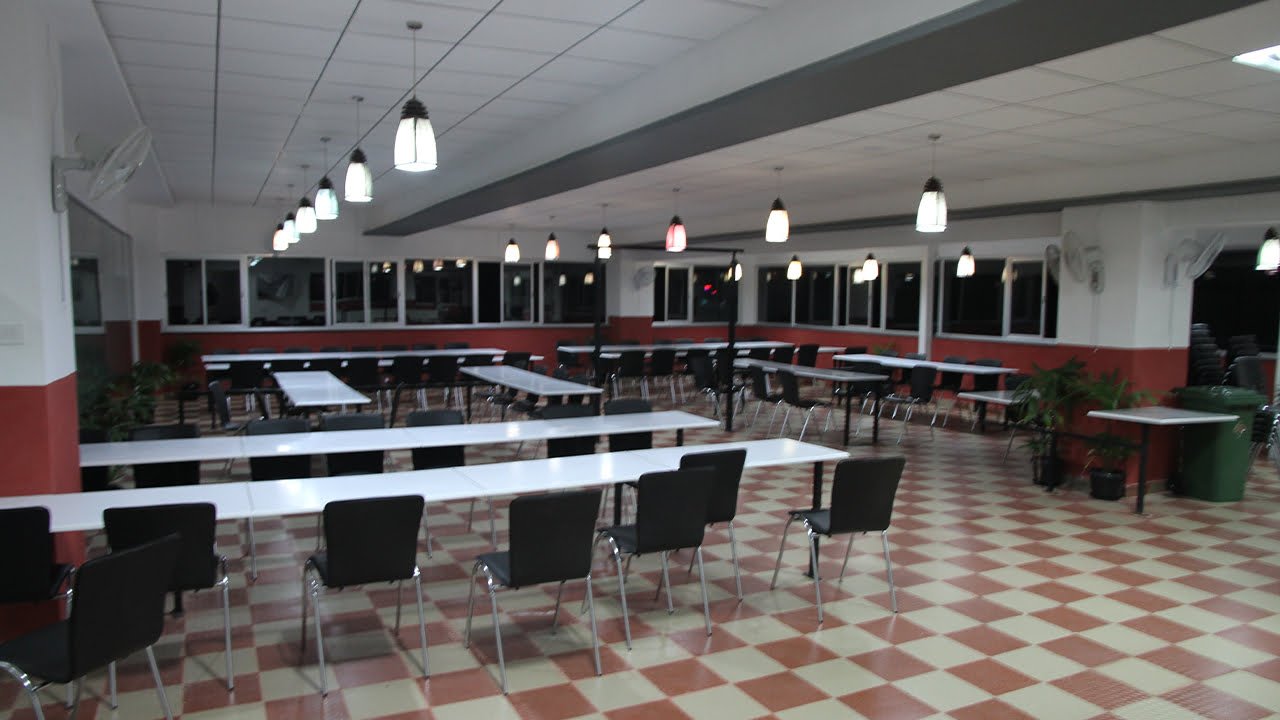
• The community areas were designed to offer strong visual encouragingproductivity
